How to build an effective sign up form close
In Musings

Your registration process is a make or break interaction with your audience.
- On arrival I am greeted with a sign-up form to complete, even before I can actually engage with the service! Or…
- The registration requirements are so scary that I give up and go elsewhere. These sites confuse and irritate and its unlikely I will return later. I may even share my feelings with my online communities.
-
Don’t make me sign up to your site until you really need to! I recently read an excerpt of Luke Wroblewski’s book Web Form Design: Filling in the Blanks, which claims “Sign Up Forms Must Die”. The well-known interface designer from Yahoo explains the process of Gradual engagement; which is the concept of not welcoming your first time user with a big form but actually giving them a chance to use the service and see the value. Gradual engagement is all about getting the user to familiarise and engage requested information in exchange. Would you disclose your personal details or spend time registering if there was no clear value to you?
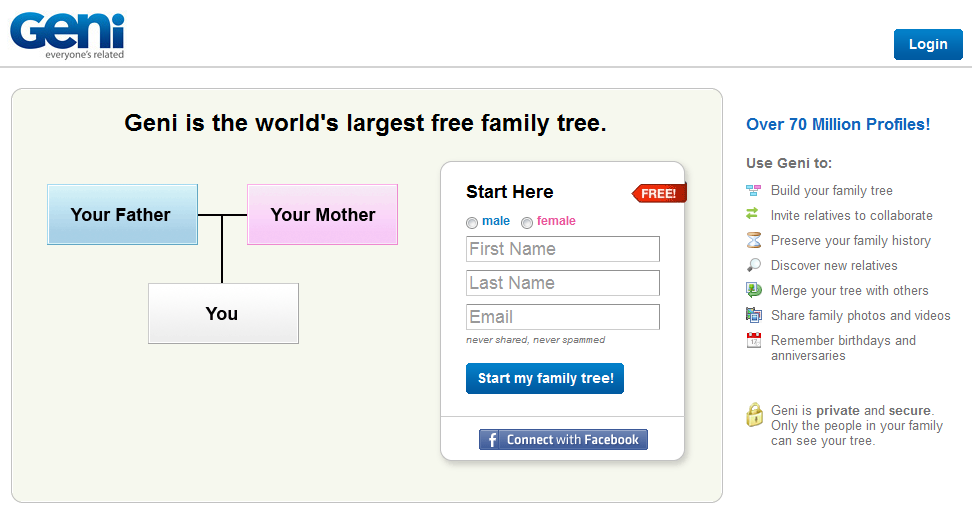
To explain this concept, UI’s guru uses the example of Geni, the free family tree service. When you arrive on the site, the first thing you do is build your family tree, starting with yourself and therefore entering your name and email address. Instead of asking you to fill out a registration form, you are immediately engaged in creating your family tree. Whilst you are investing time and effort in the site by adding your relative’s name, Geni sends you an email with your username and a link back to the site so you can come back to your family tree anytime and possibly create a full account to take advantage of all the features of the site. Without noticing it, I started building my family tree and was signing up to the service! By removing barriers, Geni managed to get over 45 million profiles. Definitely a good example to follow!
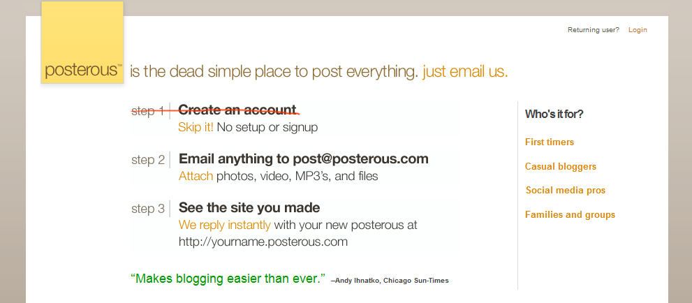
Gradual engagement - the email option: Posterous (blogging service) doesn’t ask you to sign up before being able to use their service; instead you just need to send your first post to their email address. You get started straight away and further the personal information can be added at a later stage.
The travel itinerary management website, TripIt helps people to organize and share their travel plans. You learn how the service works straight away by forwarding your flight, hotel or rental car confirmation emails. TripIt sends you back an email that provides access to an automatically created personal travel itinerary!
I am pretty impressed by the sign-up process of the sites cited above. They all succeed in clearly communicating what their site is about in one page and engage me straight away without an explicit registration form.
-
Don’t force me to register, I am here to buy your products - If you are running an e-commerce website, it sounds pretty obvious but let your users browse and buy the goods before asking them to register. Users are coming to your e-commerce site to shop for something and as a retailer, you should be eager to sell, a lot! Don’t force your users to register before you actually close a sale. Insisting on customer registration before people can actually make a purchase is often the reason for checkout abandonment. There is little point in registering before hand as you are already going to enter your details during the checkout process anyway! Let your customers purchase first and then let them deal with registration afterwards (if they want).
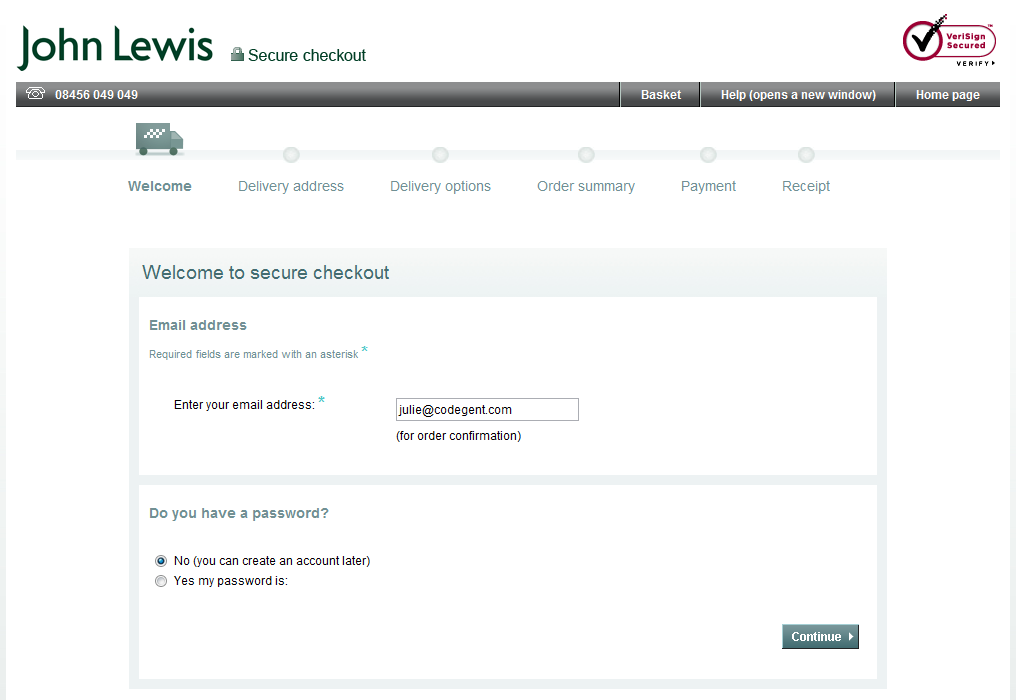
Let’s take a look at John Lewis’s check out / registration process as I really think it is done right. They don’t insist on registration and allow you to transact without signing up. You just need to enter an email address and most importantly, the password entry is not compulsory for new customers. Instead they give users the option of choosing a password and registering later in the process. The user experience is very enjoyable and I am doing what I was expecting to do when I arrived on the site, namely, “buying my product”.
When setting up a registration, do it at the end, after your customers have made their purchase and try to set it up based on the information they gave you to make their purchase.
-
Make my life easier by integrating a third party authentication system – It is highly recommended to add identity registration tools which will speed-up the sign-up process. These services allow users to log into various sites using their existing credentials. With a single click, users’ information like name, birthday, location... can be pre-populated automatically into a registration form. The benefits are simple: you accelerate the signup process by reducing the time it takes to collect information and your users get more time to enjoy and engage with your website.
-
Facebook Connect allows Facebook users to register for your site and set up a profile using their Facebook account information. Just by adding a "Facebook Connect" button users can register and log in to your site in one click. Facebook states that adding Facebook Connect has increased registration by up to 300% for some of their Facebook Connect partners.
-
And the others... Google Friend Connect makes registration simple, letting users sign in to your website with their existing account information (e.g. Google, Yahoo, AOL). Twitter OAuth allows users to connect their Twitter account with third-party services in one click. And finally, OpenID is a free and simple way to use a single digital identity across the web, without needing to create new passwords each time. However, OpenID has been around a while and its adoption numbers are still relatively low.
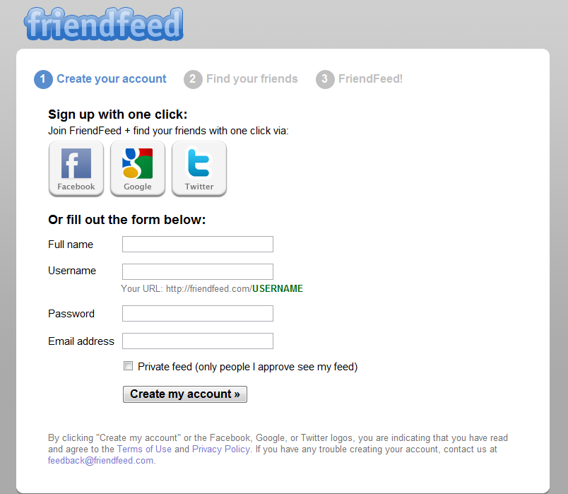
If your users are not using these sites or don’t want to sign-up using this solution, you will need to always have an alternative and to build your own authentication system.For example Friendfeed allows people to register with just one click using their Facebook, Google or Twitter information. If the user doesn’t want to sign up with one of those sites, you can simply fill out a simple signup form.
-
Facebook Connect allows Facebook users to register for your site and set up a profile using their Facebook account information. Just by adding a "Facebook Connect" button users can register and log in to your site in one click. Facebook states that adding Facebook Connect has increased registration by up to 300% for some of their Facebook Connect partners.
-
Do you really need to ask me where I am living up front? Do you really need to know that anyway? You have probably come across a website that tries to get as much information it can from you and most of the time, this information is not going to critical to the usage of the site. If I am about to sign up for your web application and got asked my postal address, I would be rather surprised! If your signup form is requiring unnecessary information, it is likely you will get a poor number of users. This typical error is very simple to fix though. Don’t be greedy and ask for marketing information if you are never going to use it to the user’s advantage.
Ensure the sign-up form is as short as possible - for many sites, the only information needed up front are name and email address. Username, password preferences, profile picture and likes can be asked at a later stage. It is really important to limit the amount of information you need in the first part of the authentication to the absolute minimum. If some fields are optional, they don’t need to be there. Users can always fill them out later on their settings page. It is important you don’t make potential customers do more work than they have to at the first stage; keep your form short and easy to fill in.
-
Some other quick sign-up form tips
- Try to avoid the CAPTCHA. Personally I think there are better ways to see if your user is a human or a bot. The reason I am not a big fan of it is that most of the time it is barely legible and I make errors which is very frustrating. There are better ways to validate data.
-
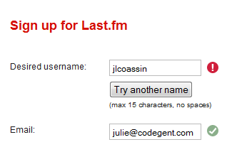
It is always good for the user to provide live inline validation / help using AJAX. This will ensure he does not make mistakes whilst filling in the form and before hitting the submit button.
-
I like the fact that Friendfeed, Facebook, Twitter and some others don’t ask you to enter your password twice!
-
We are all different and all need different levels of information to be convinced to do or use something. It is recommended you provide gradual levels of description for your service starting with a one line description and, if the user is not convinced, moving to a second level of information like a video or product tour. Beyond that you need to provide a full feature list of the service, testimonials, forums etc. and let them take a look at the actions of current users. There is a good chance they will be influenced.
-
Bear in mind that sign up and discovery can then become inseparable.
-
Be inspired; your form will attract many more sign-ups if it has a clean, simple and attractively designed. Some examples include: tumblr, Vimeo, Brightkite (note the CAPTCHA alternative “What day comes after Monday?” - this question is much more fun!), Strawpoll and many more.