In search of the best e-commerce experience close
In

A recent project we have been working on here at Codegent has required us to design a new e-commerce site. Whilst working through the wire-framing / design process it got me thinking about whether there was a perfect checkout design and how the experience changes depending on what you are selling.
So, I thought an interesting subject for the blog this month would be to take a look at some e-commerce sites that have caught my eye and share some of the learnings I have gained.
 Uniqlo
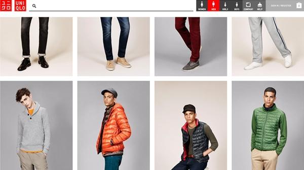
The beautifully simple Uniqlo US site was one that caught my eye immediately. The way the site uses clear and simple iconography with a simple bold colour palette teamed with the shoot imagery gives off a very clean, uncluttered look. You immediately know what you are looking at and how to navigate around the site.
A lot of fashion websites are very much style over substance but I think this site has managed to bridge the gap.
The part that really grabbed my attention with this site was the way the top navigation stayed static whilst the site scrolled underneath. I have seen this technology used a lot on different sites but never on an e-commerce site. It is a simple effect but it allows the customer to have the basket/checkout button always in view.
 Mr Porter
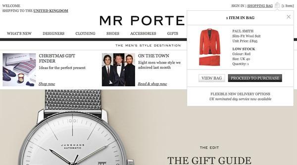
The Mr Porter site is always a big source of inspiration for me. Their use of typography over the top of a very gridded layout gives off a very confident, masculine feel and their great use of product shots almost seduce you into buying those £500 pair of shoes! (well almost)
But the seduction does not just stop at browsing the products. When you arrive in the checkout process and you are filling in your personal details they also give you free ‘Mr Porter premium packaging’ and then print a personalised label with your name on that is pre populated from your name field in their handwritten style font.
This is a great example of giving the customer that feeling of 'special treatment' through the checkout process almost as you would expect in a shop. This particular style suits this type of premium site, but whatever site you are working on, if you are able to break up the sometimes lengthly checkout experience and make the customer feel special for a short period of time it really goes a long way.
 Made.com
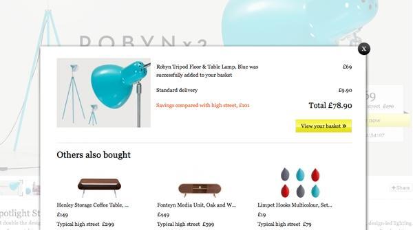
The Made.com site communicates its business model effectively, i.e. cutting out the wholesaler and the retailer and selling direct to the public. They do this with clear and effective messaging around the site. This is helped by the stylish black and white design and then picking out the key messaging and call to actions in a bright yellow to make them unmissable.
Everytime you add a product to your basket on the site you are given a pop up window with a summary of your order and also a few suggested items that other customers have also bought underneath.
This is a great way of catching the customer when they are in the buying process and offering them a choice of extra items that in this case 'other people have bought'. This works especially well in fashion e-commerce sites where you are wanting someone to recommend products to go with what you bought.
I think this is a great feature to include in your e-commerce design to increase basket spend and I think in the checkout stage is the perfect time to do so!
 Oliver Spencer
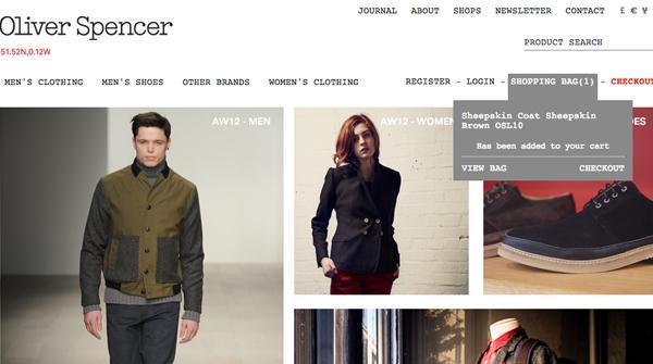
When we were wire-framing the checkout process our main aim was to really streamline the process and ideally get the number of steps down to an absolute minimum. This helps reduce the amount of work the customer has to do to complete the purchase and ultimately reduces the drop off rate.
Research into the top 100 grossing e-commerce websites states that average checkout process consist of 5.08 steps. However the findings show that the number of steps don’t have too much effect on the overall drop off rate as long as the steps don't go over 7. According to Christian Holst's post at Creative Bloq on The state of the e-commerce process, the key is not to focus too much on the number of steps in your checkout - instead spend your resources on what the customers have to do at each step. No one wants just one massive step that you have to scroll down the page filling out what seems like a never ending amount of field boxes.
I have included this example of the Oliver Spencer website as they have managed to get it down to one step without making the page too overwhelming!
 Asos
Asos
Asos in my opinion is one of the best e-commerce sites out there and is one of the main sites that I go back to over and over again to find examples of the best practice in e-commerce.
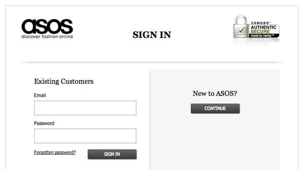
My main design learning from the site and something that I read about here Persuasive checkout best practice from ASOS is the way the whole checkout experience is enclosed within a key line box. They do this to focus the customer on the checkout and to get rid of any other distractions. Then inside the checkout box they also include a security symbol to reinforce to the customer that their details are safe.
Another part of the site that caught my eye features on the login screen. The way the site allows you proceed to the checkout without creating an account. Asos have a simple screen giving you the option to login if you do have an account or to continue as a guest. and Then you are presented with the option to create an account if you want by adding a password at the end of the checkout process.
Allowing the customer to enter the checkout as a guest is something I am seeing on more and more sites and in my opinion is becoming more and more important in getting the customer to complete the purchase. When a site does not let you proceed as a guest it can get really frustrating. Users are put off creating accounts for two main reasons:
- The time it takes to fill out the forms
- Directly relating signing up for an account with receiving newsletters which most of the time they don't want
If you needed any more convincing, this quote from ASOS E-commerce Director James Hart highlights how important little details like this are.
We didn’t fundamentally change any functionality or page flows at this point. One thing we did change was the login screen after lengthy split testing; the changes resulted in a 50% decrease in abandonment of the site at this page.
 Vanmoof
A slightly more random addition to the list now, but none the less impressive.
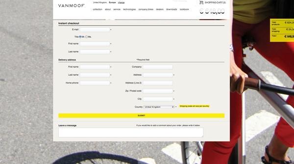
This site apart from being beautifully designed is packed full of really nice features. Stunning bike imagery sells in a lifestyle associated with the bike. Sometimes on websites you are enticed into a new world of the product then to be swiftly dropped when entering the boring checkout funnel! But not in this case.
The checkout page is scrollable on top of a large static background image. This works really well keeping the fluid feel to the site but without distracting the customer too much.
As you scroll down the page further and you can no longer see the summary of your order and the price, a small yellow box fades in on the right with a condensed order summary which I thought was a really nice touch - something that you would use but not really think about. I also love the way you can open and close the order summary.
Like I said these are small details, but it is worth spending time making the checkout process as well designed as the rest of the site and not leaving it as an after thought.
 Lastminute.com
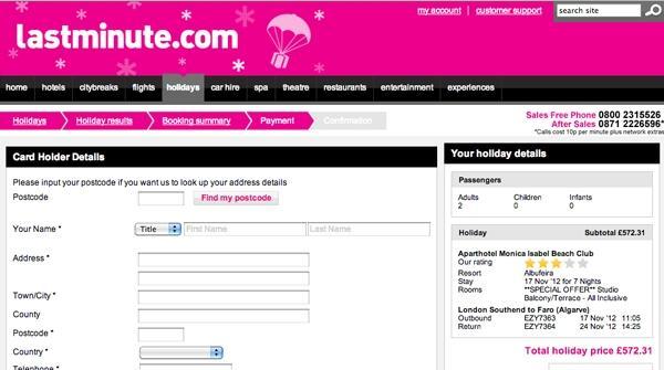
Lastminute.com do a great job of selling you lots of extras to your holiday without making you feel like you're doing too much work.
They do this through a combination of clever call to actions giving you the impression that you are only one click away from booking your holiday. They don’t use words like proceed and continue that could potentially give the customer a feeling there’s a lot more to come but rather a simple and effective ‘book now’, even if you have another page of information to fill out.
Finally, the clever breadcrumb trail showing you the checkout steps is mostly filled in once you arrive at the checkout giving you the impression you are almost there.
Summary
If I could have one takeaway from all these findings it would be that it’s important to tailor the process around the product and the consumer, based on the assumption that there's no one hard fast rule to follow as all products and consumers of those products will have slightly different buying processes.
In summary, sites like Asos and Amazon are great to follow as they have put a lot of research into how people shop online and their business success depends on this. But I have found it’s great to use these examples as a guide for best practice but then to tailor your e-commerce design around your customer. If they are ordering a pizza it needs to be quick and easy – they’re hungry! If they are buying a £500 pair of shoes they need to be pampered and if the customer has just made the big step in booking a £2000 holiday then why not try and sell them other holiday add-ons and keep them on the site for that bit longer - they clearly have money to burn and people kind of expect it!
Everything on the page of an e-commerce site and the checkout experience needs to be considered. Whether it's white space, a CTA, the positioning, the colour, or the message, every aspect needs lots of love. And finally make sure the imagery you use really sells the product like a shop window on the high street would.