The science of design close
In Codegent College

In recent weeks I seem to be getting more and more briefs landing on my desk, requesting "web 2.0" graphics or a "Glassy effect". I find it interesting that this language has seeped into to the mainstream, however, this is a prime example of clients jumping allowing their personal preference to get in the way of their audience's preference. This way of thinking relegates the design process to simply applying a style and colouring in-between the lines and doesn't consider the design as communication.
Design should never be a style or a fashion rolled out and applied to a wireframe. Design is about relevant effective communication with your target market. It is often forgotten that the design is the first experience a user will have with your website. Before the user has read a word, they have already scanned over the page, taken in the visual language and made an instant decision on whether or not this is the right sort of site to be able to find what they are looking for. This is where good design will stand out and help guide the user through the page, without them even knowing. For the best design does not announce itself to its audience but is accepted and engaged with without them even realising.
Here at codegent, once we have identified the audience we want to communicate with and the key message which we want to leave them with we begin intensive research into that audience. We look at competitors and then look at other brands which our target audience engage in. I have written before about the crucial nature of knowing your audience but I can't stress this enough. You need to know everything about your audience, you need to know where they go online, whether they use social media, whether they access their email through a blackberry, the kind of visual language are they used to, what sort of symbols they associate with value. By getting to know your audience, you can learn the best visual language to communicate to them with .
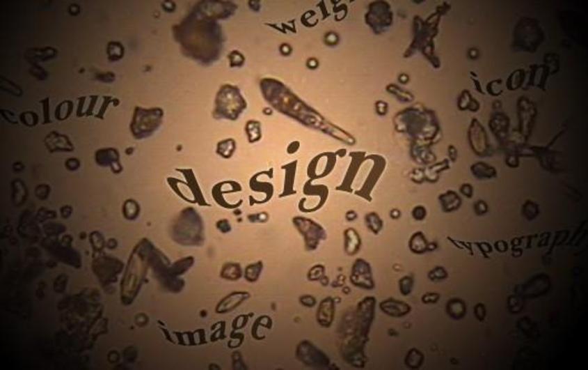
Once we have collected this information we sit down and analyse the visual language. In the simplest terms this is identifying themes in typographic styles, colours used, style of photography and how these graphic elements are brought together. Once this visual language has been deconstructed and the meaning of all of these symbols has been identified, we can use this visual syntax to be able to create the right message for the right audience. This can then be used to guide the audience through the website, getting them to take the path we want them to follow .
This semiotic approach is at the heart of all good design. By taking this approach all design decisions become quantifiable and it removes personal preference. As much as the client's wife may want to make it "glassy", if the researched visual language doesn't support this, then it is the wrong decision to make.